
The New York Times Logo Had a Period Until 1967
You might find it coincidental that The New York Times removed its iconic period in 1967, the same year that color TV became mainstream in America – both representing pivotal shifts toward modernization. While you'd likely overlook a tiny dot in the newspaper's masthead today, this small punctuation mark once carried significant weight in establishing the paper's authority and traditional values. The story behind its removal offers fascinating insights into how even the smallest design elements can impact a brand's evolution and bottom line.
The Period's Historical Significance (1851-1967)
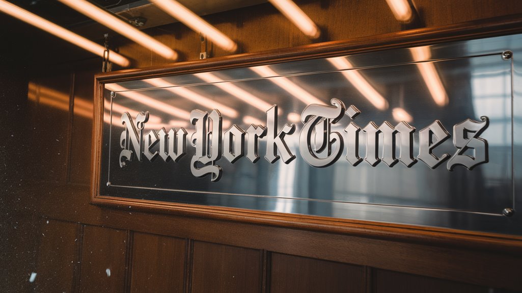
When The New York Times first launched in 1851, its logo proudly displayed a period at the end, mirroring the style of its British counterpart, The London Times. The period symbolism represented more than just punctuation – it conveyed authority and adherence to traditional aesthetics in newspaper publishing. The removal sparked heated debate and saved the paper six hundred dollars annually in ink costs.
Under the direction of art director Louis Silverstein's redesign in 1967, the logo underwent its most significant modernization.
You'll find it interesting that the period remained a steadfast element of the paper's visual identity for over a century, appearing alongside the ornate Gothic lettering that characterized the original logo.
During this time, the newspaper underwent several changes, including dropping "Daily" from its name in 1857 and removing the hyphen between "New" and "York" in 1896.
Yet through these modifications, the period persisted as a symbol of the paper's commitment to formal journalism until its eventual removal in 1967.
The Evolution of Typography and Design
The rich typographical heritage of The New York Times extends far beyond its iconic period.

Early typographic trends, from black letter fonts to Linotype machines, shaped the newspaper's visual evolution throughout the late 19th century.
When you examine the design innovations that followed, you'll notice the significant impact of art directors like Lou Silverstein and typeface designers like Edward Benguiat.
The evolution of newspaper typography gained significant influence from Times New Roman, which was originally created for The Times newspaper. They've helped maintain the newspaper's commitment to clear, readable text while preserving its classic black letter style.
The Times hasn't stopped evolving, either – from the introduction of Times Modern in 2006 to ongoing digital typography developments, you can trace how the paper continues to adapt.
Yet through all these changes, the logo's fundamental design has remained remarkably consistent, symbolizing the newspaper's enduring legacy.
The newspaper's first home was a six-story brownstone that lacked basic amenities like windows and gas fixtures.
Behind the 1967 Redesign Decision


In 1967, art director Louis Silverstein made a bold decision that would spark both controversy and savings – removing the period from The New York Times' iconic logo. The redesign wasn't just about the period; it included subtle tweaks to letter shapes and replacing the arrow in the "T" with a diamond, all aimed at strengthening the logo's design aesthetics. The changes were overseen by typographer Edward Benguiat's design, which preserved the original font's character while modernizing its look.
While the change saved roughly $600 in annual ink costs, reader feedback was swift and heated. About 1,000 subscribers canceled their subscriptions, demanding the period's return and citing grammatical concerns. Much like the nuclear secrecy blog, this redesign sparked intense audience engagement and debate.
Despite the backlash, Silverstein's vision proved forward-thinking. The simplified design helped modernize the newspaper's image while maintaining its traditional appeal, ultimately contributing to the logo's enduring status as one of the world's most recognizable media brands.
Cost Savings and Modernization Goals
By modernizing The New York Times logo in 1967, Louis Silverstein achieved both practical savings and aesthetic goals. The removal of the period and font adjustments led to significant cost efficiency, saving approximately $600 in annual ink costs – equivalent to $5,500 today. Like Milton Glaser's work that was done pro-bono for NYC, this redesign prioritized the greater good over profit.
You'll notice the redesign wasn't just about saving money. Silverstein enhanced design clarity by making thick font elements thicker and thin elements thinner, creating a more visually striking appearance. Edward Benguiat's contribution as the primary logo designer brought distinctive character to the redesign.
The simplified logo, free from its period, reflected the broader cultural shifts of the mid-20th century while establishing a more cohesive brand identity. These changes helped create an instantly recognizable symbol that has stood the test of time, proving that practical considerations and aesthetic improvements can successfully work together in logo design.
Key Players in the Logo Transformation
Several influential designers have shaped The New York Times logo throughout its evolution, with Louis Silverstein, Edward Benguiat, and John Parkinson playing pivotal roles in its modern transformation.
You'll notice Silverstein's major design influences in 1967 when he removed the period and adjusted the font thickness, while Benguiat refined the letters and replaced the "T" arrow with a diamond in the late 1960s.
More recently, branding strategies have taken an innovative turn with Lana Z Porter and Kevin Zweerink's work on the R&D department's logo.
They've introduced a dynamic, generative design using the Karnak Black font, which responds to team activity through Github commits and Slack interactions.
This algorithmic approach represents a significant departure from the traditional static logo, reflecting the department's experimental nature. The new identity aims to showcase the team's dynamic energy online while fostering meaningful conversations with like-minded organizations.
Legacy and Impact on Modern Branding
While many brands struggle to maintain relevance across decades, The New York Times logo stands as a masterclass in enduring design principles. Its unwavering visual consistency and distinctive brand identity have influenced countless organizations across industries.
You'll find its impact reflected in modern branding strategies that prioritize simplicity, recognition, and longevity.
The logo's timeless appeal creates vivid imagery through:
- Bold black letters against crisp white backgrounds
- The distinctive Benguiat font that commands attention
- Clean lines that translate seamlessly across digital platforms
- The absence of unnecessary embellishments
- A perfect balance of classic and contemporary elements
The 1967 period removal proved that subtle changes can modernize while preserving heritage.
Today's designers continue drawing inspiration from this exemplary case of brand evolution done right.

Similar Posts

The Doomsday Clock: Humanity’s Most Terrifying Countdown
Despite tracking global threats since 1947, the Doomsday Clock’s latest reading reveals an unprecedented warning that should make everyone nervous.

Could Gustave Whitehead Really Have Beaten the Wrights to the Sky?
History’s first flight may not belong to the Wright brothers – discover the controversial story of Gustave Whitehead’s hidden legacy.

Cap’n Crunch’s Whistle Hack: The Start of Phone Phreaking
In 1971, a toy whistle from a cereal box exposed AT&T’s billion-dollar network, sparking a tech revolution that influenced Apple’s founders.

Did We Accidentally Launch a Manhole Cover Into Space?
Mysterious Cold War nuclear test may have turned an ordinary manhole cover into humanity’s first accidental space traveler.

Tesla vs. Edison: The Shocking Rivalry That Lit the World
Sparks flew as Tesla and Edison waged an electrifying war that would determine how humanity harnessed the power of electricity.

Cap’n Crunch’s Whistle: How It Led to Phone Hacking
Unraveling how a toy whistle from Cap’n Crunch cereal boxes led hackers to crack AT&T’s phone network and sparked a tech revolution.